The Ergonomics Principles and Their Applications
The user experience is the core of the design process, and we, as designers, apply existing design processes such as the Double Diamond Design Thinking to improve our user’s experience and achieve the so-called empathic design. But the process is not that straightforward as we need to consider several human and non-human factors during the design process, and part of these factors relate to the context of use and how the product or service is used, which is known as the ergonomics, a widely known set of considerations that design to apply to different designs and services to achieve user satisfaction (What is Kano Model Analysis?).
What is Ergonomics?
Ergonomics also referred to as human factors and ergonomics, refers to designing products, services, systems and processes with social interaction in mind. The principles of ergonomics ensure that the design complements the consumer’s ability strengths and strives to minimize the effort and limitations while using the product rather than forcing them to adapt. Ergonomics is widely implemented in different industries, affecting the creative sector. Ergonomics principles were discussed by Wickens et al. in their book Introduction to Human Factors Engineering. The ISO 6385 guidelines provide a detailed description of the principles of ergonomics that need to be considered when designing different products, services or systems.
The concept of ergonomics is closely linked to inclusive design, where users with different abilities and conditions are considered in the design to ensure its suitability for a wider range of users (How Inclusive Design Reshaped Microsoft Products). Recently, the principle of ergonomics extended to the software system. So, different operating systems and on top of them, Apple has introduced features that can help users with different sight spectrums or conditions to easily use their mobile devices (Design Thinking Case Study: Innovation at Apple).
Ergonomics and human factors can also be linked to behavioural design and how to use different technology tools to not only deliver a user-friendly product but also drive users to use it in a healthy way, such as the mobile usage hours report, which can attract users attention to how many hours they spend on their devices and how to improve their usage experience.
The 10 Principles of Ergonomics
The ISO 6385 guidelines provide a manifesto for the principles of ergonomics that need to be considered in the design process. While the 10 principles of ergonomics below are mainly for physical products, they may hold thoughts to consider in the user experience in digital products as well.
1- Neutral Postures
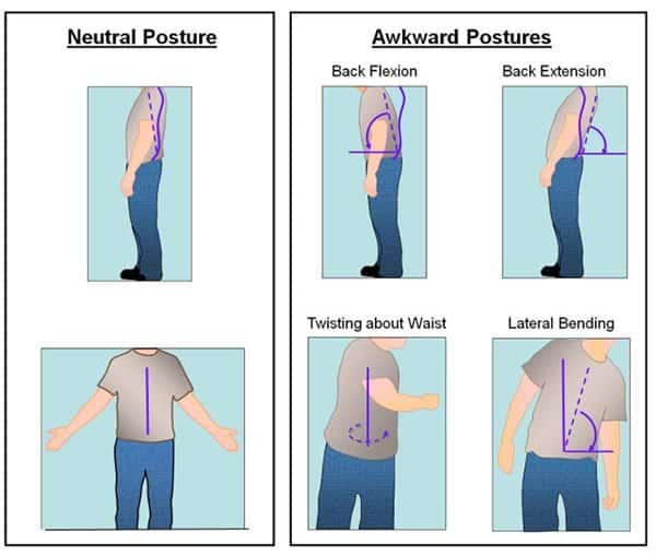
The neutral posture refers to the human body being aligned and balanced. The standard and balanced posture reduces the stress applied to muscles, tendons, nerves, and bones. The unbalanced posture of the human body is known as an “awkward posture”. The usage of the designed product should avoid putting the consumer in an awkward posture. For example, the product design should ensure that the consumer is not forced to use awkward postures in order to use the product.
While this principle applies more to physical products, it can still be applied in digital designs. For example, interactive design should consider a quick reach for information so users do not need to spend long periods of time in front of a computer or mobile screen.
2- Reduce Excessive Force
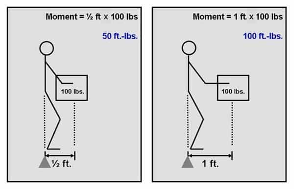
The design for heavy products should consider reducing the excessive force needed or used to pull, push, or carry the product. Alternative solutions should be adapted to reduce the use of force, such as using wheels for these products. Also, adding handholds can reduce the force used to carry objects. This principle is viable in physical products with little need or implementation in the digital domain.

3- Work in a Power or Comfort Zone and Keep Things Easy to Reach
This principle is widely applied in both the physical and digital domains. Interaction with a specific product should be made easy. Users should be able to reach the product easily and interact with it. For example, the control panel for dishwashers should be reachable with the minimum amount of effort and time. In digital designs such as websites and mobile applications, users should be able to reach functions and navigation links easily through the usable implementation of the layout (How to Conduct Heuristic Evaluation?).

The power zone refers to the zone where interacting with objects has the least amount of effort spent, it is also known as “hand shake zone”. It is the area between mi-thigh and mid-chest height. If the product is designed to be held, the designer should consider this position as the standard.
4- Reduce Excessive Motion
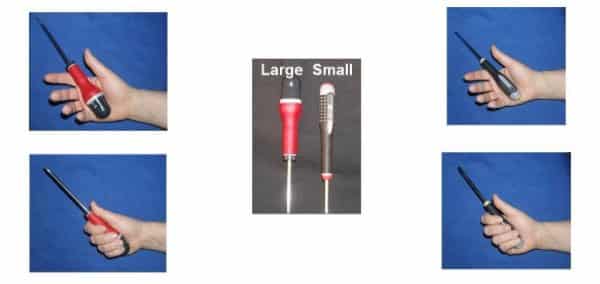
This principle aims to reduce the amount of motion spent while dealing with the design. The motion refers to any movement applied using the figures, wrist, or other parts of the body. One of the examples of applying this principle is the usage of screwdrivers. The electric screwdriver is designed to reduce hand motion during usage.

5- Reduce Static Load
Static load refers to the position where the person stays in the same position or holds something for a long time. This load create discomfort fatigue. If the product requires the consumer to stand still for a long time, such as holding a specific tool, a fixture solution needs to be applied in order to eliminate the need to hold the object.
6- Minimize Pressure Points
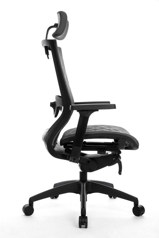
The pressure point refers to the point where the object is in contact with the user’s body during the usage of the product. For example, high chairs make a pressure point between the user’s legs and the table or desk. Therefore, designing the chair should allow users to modify the height, and subsequently, it can be used with any table height.
7- Provide Clearance
The design for products and interiors should provide a space for the user to move freely and avoid dumping into any of the objects. The same concept is applied in the digital domain. Placing the functions and elements in the website design or mobile application device should allow the user to move between the functions smoothly and avoid any confusion, such as clicking on the wrong buttons.
8- Enable Movement and Stretching
The product design should consider the user’s need to move, exercise, and stretch. For example, seat design includes options to adjust the setting style. Tables that force one to stand up or be in one place may be modified in some places to avoid the long setting time.

9- Reduce Excessive Vibration
Vibration has a serious impact on consumer health. Contacting vibrating tools may cause hand-arm vibration syndrome (HAVS). Therefore, designing products that use motors or vibrate while holding should consider this principle. For example, the motor part can be separated from the tool itself and connected to it using a cord instead. This reduces the vibration on the tool.
10- Provide Good Environmental Conditions
The overall work environment should be comfortable and allow users or designers to have good lighting, fresh air, and enough space. In offices where computer screens are installed, the design of the light systems should avoid reflections caused by the polished computer screens. This principle focuses solely on the context of use and the environment that users are in while using the product or service.
Conclusion
Ergonomics aims to consider the user environment and behaviour while using a specific design of the product. These principles of ergonomics could be applied to both physical and digital products. While the above principles provide general rules to follow while designing user-friendly products, special guidelines or considerations may be applied based on the product user experience and marketing research. It is not necessary that the principles above apply to all designed products. Some principles may not be applicable in some designs.
Bibliography
Dul, J. and Weerdmeester, B., 2003. Ergonomics for beginners: a quick reference guide. CRC press.
Elbert, K.K., Kroemer, H.B. and Hoffman, A.D.K., 2018. Ergonomics: how to design for ease and efficiency. Academic Press.
Stanton, N.A., Salmon, P.M., Rafferty, L.A., Walker, G.H., Baber, C. and Jenkins, D.P., 2017. Human factors methods: a practical guide for engineering and design. CRC Press.

