Five Principles for Successful User-Centered Design
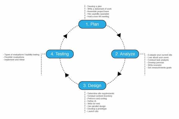
Look at the various products in our daily lives. Why do we love specific products while we get frustrated with using others? Why you prefer to use a specific brand over the other? I still remember the day I switched from Windows to Mac OS. I am sure you have a similar experience about one of the products out there. Actually, many factors affect the success of products in the market, and on the top of them is meeting the consumer’s needs, which is known as user-centered design. In a previous article, we talked about the Characteristics of Human-Centered Design and how to identify the user-centered design process.
Human-centered design can be defined as the process that places human needs and limitations at a higher priority compared with other targets during design thinking and the production of differential stages. However, achieving the user-centered design approach requires adopting a number of principles that aim not only to ensure placing the user in the heart of the process, but also build a solid place of how the user will interact with the product and the characteristics of this interaction. These principles include the following five elements.

1. Design for Your Users and Their Needs
The first principle in building a user-centered design process is to put your user in the heart of every development stage of the product or service. The process starts with the definition of the problem that needs to be solved — or the value that is hoped to be added to the final product — and then delivers, followed by collecting consumer feedback. This can be only achieved through deep understanding of the target user characteristics and needs, which can be acquired through in-depth user experience research and building an empathy persona that can highlight user behavior and impressions.
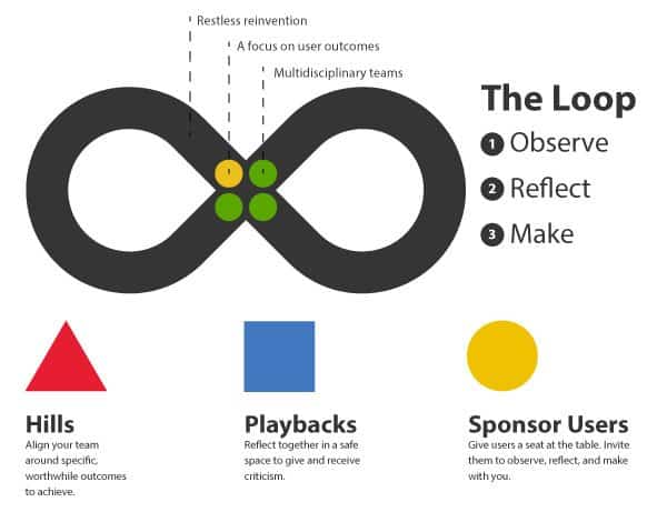
The user experience research results should then be processed in a design thinking process that intends to keep this user-centered approach as a priority during every development stage. Design thinking models such as the d.school Stanford model, Design Council double diamond model, and IBM design thinking models aim to focus the development process on the user’s needs and ensure this target is met during the production process.

In addition to focusing on the user, designing for the user aims to build a self-explanatory design form and function. Users should be able to communicate with the design without barriers or complexities. This can be achieved through empathic design process that intends to put designers in the shoes of the user. The development of prototypes should be tested and validated by real users in order to ensure smooth user experience while using the product or service.
2. Build a Consistent Design
Consistent design aims to build a unification between both form and function during the user experience while using the product or service. This consistency intends to educate users about the product. So, users understand the different deign elements, color codes, and shapes based on their literature experience from the user’s journey through the product design’s flow of interfaces, functions, or services. This consistency between product design elements contribute to reducing the learning effort required to understand how the design works and how to use it properly.
The consistency principle expands toward the user’s logical options and deals with product details such as the ergonomics principles, as users tend to use products in a way that reduces physical effort and ensures comfort. Another related factor to the consistent design is the requirement to understand user demographics in order to deliver localized design that meets with the user’s culture and life. For example, users who speak left-to-right languages such as English tend to navigate screens from left to right, on the other hand, users who speak right-to-left languages such as Arabic, Hebrew, and Persian tend to navigate screens from right to left.
Part of the consistency principle is to build a user experience that intends to reduce the errors or guide the user toward the correct path in order to achieve a specific goal or use the product properly. This can be achieved through physical and visual design elements such as using a red light for an alert or the color green to indicate that the product is turned on. Also, displaying alert message when an error or improper usage of the software application that intends to correct the user’s path.
3. Build a Dialog Between User and Design
Many designers believe that design is a one-way process—once the design is done, the user only needs to use it. However, this isn’t true. Good design ensures building a continuous communication between the design and the user. As the user uses the product, the design should interact back with a specific communication-based reply. For example, when you click on a web button, the button changes to indicate if the user rolls over it or clicks it. Also, when using a television remote control, when the user chooses a specific channel, the name of the channel appears on the screen to indicate the selection.
Another example is your mobile phone. Typing a phone number is indicated by highlighting the number, displaying the number on the screen, and hearing the click sound. These examples of feedback from the product reflects a feedback that ensures that the user is correctly using the product and that the product behaves exactly as the user expects.

Another type of feedback is the feedback that users provide over the whole experience in order to show how the product is successful in achieving the targeted goal. This feedback over the product or service is used in further product development and improvement. As suggested by the IBM design thinking model, all products are considered a prototype because they are always in a state of development and improvement, which is fueled by user feedback and experience.
4. Don’t Make Your User Think
How many times do you use your computer every day? Your mail application? Your car’s features while driving? Good design aims to reduce the users’ effort to think every time they use the product or service. Use of the product should be carved in the users cognitive knowledge, so they don’t need to spend the same effort to think about it as they did the first time they used the product. Designers should build their product’s form and function to ensure easy usage by all the targeted segments. This can be achieved through applying the earlier mentioned principles, including understanding the user, achieving consistency, and ensuring a dialog between the product and the user during the user experience journey.
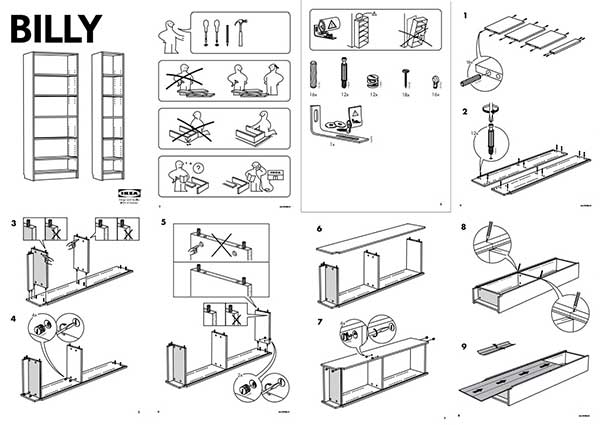
In order to achieve this principle, there should be clear information provided for the user to use the application and interact with it. A famous example for this principle is IKEA’s guide, which only include illustrations to instruct how to assemble each product—without the need of writing the steps out in words. By using the manual, you gain the knowledge to assemble future products easily and quickly because of the acquired experience from assembling previous products.

5. Let the User Drive the Process
User hate to be consternated while using this application. While the design should direct the user to the right path, the number of constraints should be minimized so users can customize their experience with the product in a way that fits with their target or needs. For example, while Apple products such as the iPhone and the iPad don’t include all the necessary application when purchased, users can go to the App Store to download millions of applications based on their needs and preferences.
Another example is car manufactures such as Mini Cooper and KIA, who target the young segment of consumers who hate to be limited by specific product specifications. Car manufacturers provide the online ability to customize their car color and options based on their favorite color combinations.
In order to achieve a successful product or service design, designers should focus on the users’ needs and build products that solve their problems or improve existing products. This can only be achieved through placing the user experience in the heart of the development process through a number of user-centered design principles that focus on the user experience even after the product’s delivery. These principles cover the research phase, the design process, and the relation between the user and the product. These principles intend to build a smooth user experience and build dialogue between the user and the product, which leads to an empathic product experience and building products that users love to use every day.


