Hick’s Law: Building Usable Navigations
Building a user-friendly UI Design involves creating a usable navigation system that allows users to easily move between pages or UI screens, and one of the laws that contribute building a clear understanding about how users navigate through different choices in websites or applications is the Hick’s Law.
It highlights that the time needed by the user to reach a decision is affected by the number of choices with which they are presented in the UI design. Hick’s law helps us to determine the number of navigation links that need to be added in the interface without negatively affect the user experience.
Related articles:
- UI Design Patterns and How They Are Applied
- How to Conduct a Successful UX Research for Your Design Project
What is the Hick’s Law?
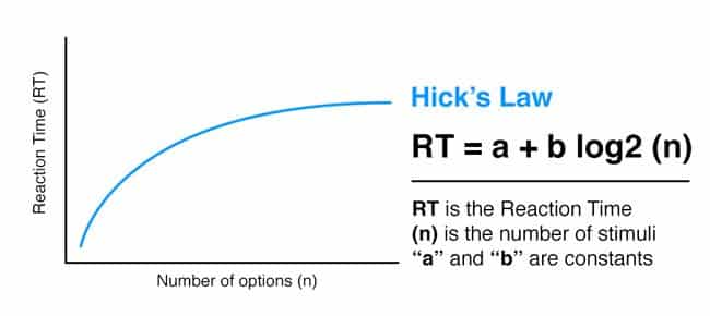
The Hick’s Law, also known as Hick-Hyman, was first introduced in 1952 to investigate the relationship between the number of choices presented in the interface and the user’s reaction time required to make a decision from these choices. Hick’ Law suggests a positive correlation between the number of choices presented to the user and the time required to make a choice, which means that the more choices the user has, the longer it will take to decide which choice to select.

The factor that is affecting the user response time is the number of stimuli (choices) because each stimulus has its own response. The Hick’s Law formula defines this principle as follows:
RT = a + b log2 (n)
“RT” is the reaction time
“(n)” is the number of stimuli (choices)
“a” and “b” are constants, depending on the task and condition.
The above formula can be affected by other factors related to the user choices such as the following:
- If one or more of the choices can be easily eliminated. This helps to reduce the interaction time
- If the user has a predefined choice to select, the time required making the decision will be reduced dramatically as the user don’t need to review other choices.
The Application of Hick’s Law
In the interaction design, Hick’s Law is commonly used to determine the how the choices are organized in the user interface in a way that can help users to make their choices quickly and easily. It involves the design of machine control panels such as kitchen machines, washing machine, and others. The law is also adopted in digital design such as website design and mobile app design. However, the Hick’s Law is not isolated from other design principles such as the grid system, Gestalt principles, the white space and symmetry. Considering these principles along with the Hick’s Law contribute building a user-friendly UI design.
In the UI design, the Hick’s Law is used to organize how to present the navigation and functions for the user in order to reduce the time required to jump to specific page, fill a specific form, or click a specific button. This should reduce the user frustration as they can easily find that they need to find in the interface design including printed materials such as food menus, brochures, or instruction boards.

If the UI design includes a large number of choices or navigation links, Hick’s Law suggests that the design needs to limit the number of the choice in a way to allow users to easily select their preferred choice. This can be achieved through the following suggested solutions:
Categorizing Choices
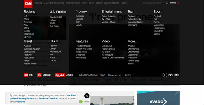
If the UI design includes a large navigation system in information-intensive website or application such as the CNN.com, then law suggests that this number of choices will negatively affect the user experience. Therefore, categorizing the choices into main navigation and sub-navigation can help users to quickly find the choices they need based on each category. The same principle is adopted in the control panel for machines as related buttons such as speed levels or program selection are added in the same category. In the small mobile screens, Hick’s Law pays even more essential role as the limited space assigned for navigation, users only need to see the targeted navigation links that they frequently use. Design patterns provide a number of suggestions that can help designers to build a user-friendly mobile UI designs that align with Hick’s Law recommendations.

In some software designs such as iOS and Android OS, the users are given the choice to organize the navigation system to meet with their most used apps or functions, which provide another smart way to easily and quickly reach commonly used features.
Limiting the Number of Choices
In some UI design screens such as payment process or registration process, the user only needs to focus on one level of functions such as filling the Credit Card information or proceeding in shopping process funnel. Based on Hick’s Law, limiting the user choices and available function can help building a user-friendly interface. In some websites, users can simply sign up using their social profile information, which reduces the time required to fill long registration forms. Another example is Amazon.com which provides a quick buy button where users save time to go through long shopping process by using their predefined preferences.
Time and Page Views
Reducing the choice time contribute to help website visitors to navigate more pages, thanks for the easy navigation system. Increasing the number page views is one of the significant factors of website success as it reflects good user experience practice and indicates that users find the website useful enough to view more of its content. On the other hand, spending a long time trying to find what the user needs have a negative impact on both user experience and website ranking.

Hick’s Law is one of the important principles that help us to understand how users make choices related to selecting specific link or function to click. The law indicates there is a positive correlation between the number of choices and the time required to make a decision. Based on this law, UI design should consider categorizing or limiting the choices such as functions or navigation system in order to help users to make a quick decision and can easily navigate between the UI elements. Hick’s Law is not only used in a website or app design but also in designing user interfaces for devices and machine.


