How New Google Logo Will Change Old Design Rules
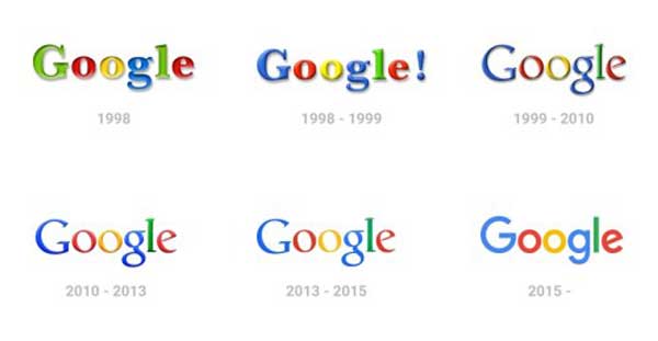
Two days ago, Google surprised the world with its new logo design after 17 years of using the same logo for their branding. The previous logo featured minor alterations from time to time, but nothing that could be called a real change. As expected, debates about loving and hating the new logo stormed the Internet with each side sharing their views on the new logo, particularly with the abandonment of the serif font and their shift to what many people think is a very casual sans serif typeface, Product Sans. In an interesting conversation with Mary Renton, Professor of Business at the North Pacific School of Business branch in Qatar, she generously shared with me her first impressions of the new Google logo as being childish and too casual for a business company. She preferred the old logo. Surprisingly, the same impression was received by most of my students following the reveal.
Behind the love/hate dilemma, another perspective should be considered. As a leading company known for its innovative portfolio, Google’s new logo not only creates a new company brand but also completely changes the way we think about logo design and how we will teach logo design to future students. Changes in user experience will result from the switch from serif to sans serif. By building the logo on the shape of dots, Google is providing a better interaction experience. Finally, the logo animation or transition from one state to another extends the logo function from a branding element to a contributor in the user experience while using any of Google’s services including search, maps, email, and others.
This new Google logo project introduces new game-changing rules in the logo design industry. Some of these rules will reform how we think about existing guidelines, such as scaling of logos and taking logo design into a more interactive realm.
Thinking Outside The Typeface Box
Logo typeface plays an essential rule in reflecting the company’s strategy, value, and the search for a unified logo appearance and feel. In addition to meeting modern design trends, these factors will contribute to how companies change their logo typeface in the future. As Google is considered a key player and one of the leading and innovative companies on many business levels, changing their old logo typeface became necessary to meet up-to-date logo trends.

The Google logo redesign is their biggest since 1999 and it is designed to be simple, friendly, and easy to rescale. Scaling the logo and gauging its suitability for different sizes are old and basic design rules. Obviously, those characteristics were expected to be in the old logo as well. However, the rule was invented in the printing era, where the logo should be scalable and clearly able to read on different print materials. The new modern scale rule is meant to target digital devices as well, with consideration of computer screens, tablets, and visibility on mobile devices.
Design for Devices
Logos are no longer limited to print media anymore. Actually, the type of digital media used to display a company logo, especially with a company using different online services and products such as Google, is much more than printed materials. This applies to a wide range of companies even outside the technology field. Restaurants are targeting their audience using websites, mobile applications, and TV ads. Logos should maintain a clear look and feel on different devices, and this can be achieved through an extended testing process to learn more about how viewers will see the logo on their different devices.

The old Google logo used a serif typeface with semi-thin glyphs and serifs that did not look good on small screens like cell phones, especially with having a different color for each glyph. The amount of serifs, colors, and thin letters contributed to make the logo unclear and appear noisy at a small size.
Designing for Interaction
Google’s new logo presents an innovative approach in logo design for our industry. The new logo is animated, changes its status, and even interacts with user voice commands. Logos are no longer a static block on the top of the web page with one interactive function: click on the logo to return the website homepage. The design for Google’s new logo is considered an interactive tool that can achieve specific new functions in addition to searching, like providing a visual guide for users to understand where they are in the process. The new logo also includes new features like an active voice search, the active service of new Google image search, Google books, and more.

The interactive capabilities for the logo should be considered in the early stages of the logo design and idea development. The following scenario shows how the Google logo interacts with the user behavior during the search process:
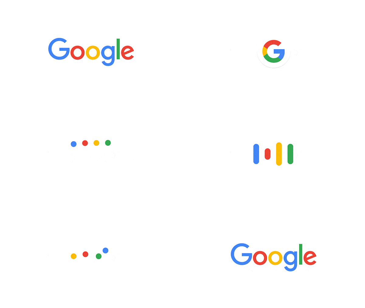
- Once the voice search is active, the Google logo morphs into dots with the same colors and number of the letters
- As the user starts to talk, the logo dots change to an equalizer that interacts with the sound of the vocalizations
- As Google searches for the results, the dots spin until the results are presented, then you return back to the Google logo
The change in status and morphing from one shape to another provides a visual guide for the user through the steps. It might be weird at the beginning, but once the user has experienced the service multiple times, the stages will be perceived on the unconscious level and form part of the search culture when the feature is used again and again.
Considering Animation
As the logo design responds to the user behavior and changes its status from one shape to another to reflect the process, the animation becomes more than a method to decorate the logo. The animation provides a transition method between each stage of the logo and each shape switches to the next in response to user behavior.
Planning for how the logo is going to be animated and logo transition involves considering how it will interact in responsiveness and the different view options for a variety of devices. The animation contributes to the main target of the logo by reflecting the brand’s message and value. For example, the Google logo animation aligns with the casual style of the new logo.
Conclusion
For decades we have been using the same logo design guidelines and adapting them to each logo project. As an innovative company, Google has introduced to the world a new design for its logo after 17 years of small alterations. The sans serif typeface has been implemented instead of the old serif font. The logo plays an interactive role as its state changes in response to user interaction within the applications, and the animation reflects the new logo’s brand and personality.
The new Google logo design will change the way we think about logo design, and reform some of the old logo design guidelines. Expect to see more involvement of logos in the user experience when using company products or services.
http://www.wedgies.com/question/55e8ce19640ddf14000011ab


