The Affinity Diagram: A Practical Case Study
During the design process, several parameters bubble during the research and ideation sessions that you need to organise, analyse and prioritise, such as application features, project tasks or organise application menus to improve user experience. Having a large amount of data collected during the research phase makes it hard for a design team to build a connection between data fragments and build an understanding of the relationship between each other. Many methods can visually represent data results from research or brainstorming, such as mind maps and affinity mapping, which I personally found very useful and conducted with many of my university students in brand design. Each of these methods organises ideas in a specific way to make it easier to track the connections between them. Your can also use the Affinity Diagram when doing thematic analysis for qualitative data collected during the design thinking process.
Related articles:
How to use Card Sorting to Improve Service Design
How Designers Can Use Rolestorming to Understand Consumers
Brainstorming Multiple Ideas Using Charette Procedure
Common Types of Mind Maps and How to Use Them
What is an Affinity Diagram?
Think of the affinity diagram (also known as the K-J as a method to organize data, ideas, and findings into groups in an interrelationship diagram. According to Andrés Lucero’s paper, Using Affinity Diagrams to Evaluate Interactive Prototypes, The tool was created in the 1960s by the Japanese anthropologist Kawakita Jiro. Affinity mapping works in a similar way to card sorting but also allows the team to vote for the priority or the importance of each of the listed items in the affinity chart.
Each item is written on a sticky note, and all the items are organised in groups based on their relationship. Then, the team members can start by naming categories or allowing the group names to bubble based on the relationship between items. It works in a similar way to the thematic analysis research method to organise qualitative data. You can use the affinity diagram in the following tasks:
- Organise data generated from brainstorming sessions and prioritise it
- Organise data collected from research in UX design
- Arrange complex opinions from key stakeholders to achieve innovation
- Understand the correlations between the collected data
- Encourage the construction of a pattern of thinking about the complex data
It is noticeable that the Affinity diagram is designed to deal with large data sets. If the collected data is small, then the tool may not function effectively as it is based on group consensus between the team members through voting.
Case Study: How To Create an Affinity Diagram?
The affinity process aims to gather ideas, opinions, and insights and group them together. Over the last few years, I’ve applied the affinity diagram tool during the design thinking process to solve engineering problems or explore brand markets. From the practical experience, I found that limiting the number of affinity process attendees to 5-6 participants is better to ensure effective results. In the below steps, we will explore an affinity diagram example. Before starting the affinity process, the following guidelines should be considered:
- Don’t talk. The idea behind writing thoughts on paper is to create the chance to think and focus on different ideas and information and identify the natural relationships between them. Therefore, it is encouraged to write the ideas and hand them to the facilitator without talking.
- Encourage ideas based on feelings. The process requires the participants to write their ideas quickly based on their feelings and ideas. This helps keep the process moving quickly.
- Acknowledge disagreement. If one of the participants disagrees with adding an idea under a specific category, he or she can simply move it to another category. This behaviour helps build an environment that accepts disagreement between people with different opinions.
In these steps, we will explore together a practical case study for a start-up company that would like to explore its current problems and prioritise them in order to identify which problems to solve first.
Step 1: Plan for the Affinity Meeting
It is important for participants to understand what they are going to experience during the meeting regarding the topic and the process. This helps them to be prepared with ideas and information. This step helps to reduce the preparation time during the meeting.
Step 2: Generate Ideas
This step includes generating ideas and writing them on sticky notes. The participants write any thoughts or information down, with each idea or piece of information on a separate note. You can use physical sticky notes, any affinity diagram template or online brainstorming tools.
Step 3: Display Ideas
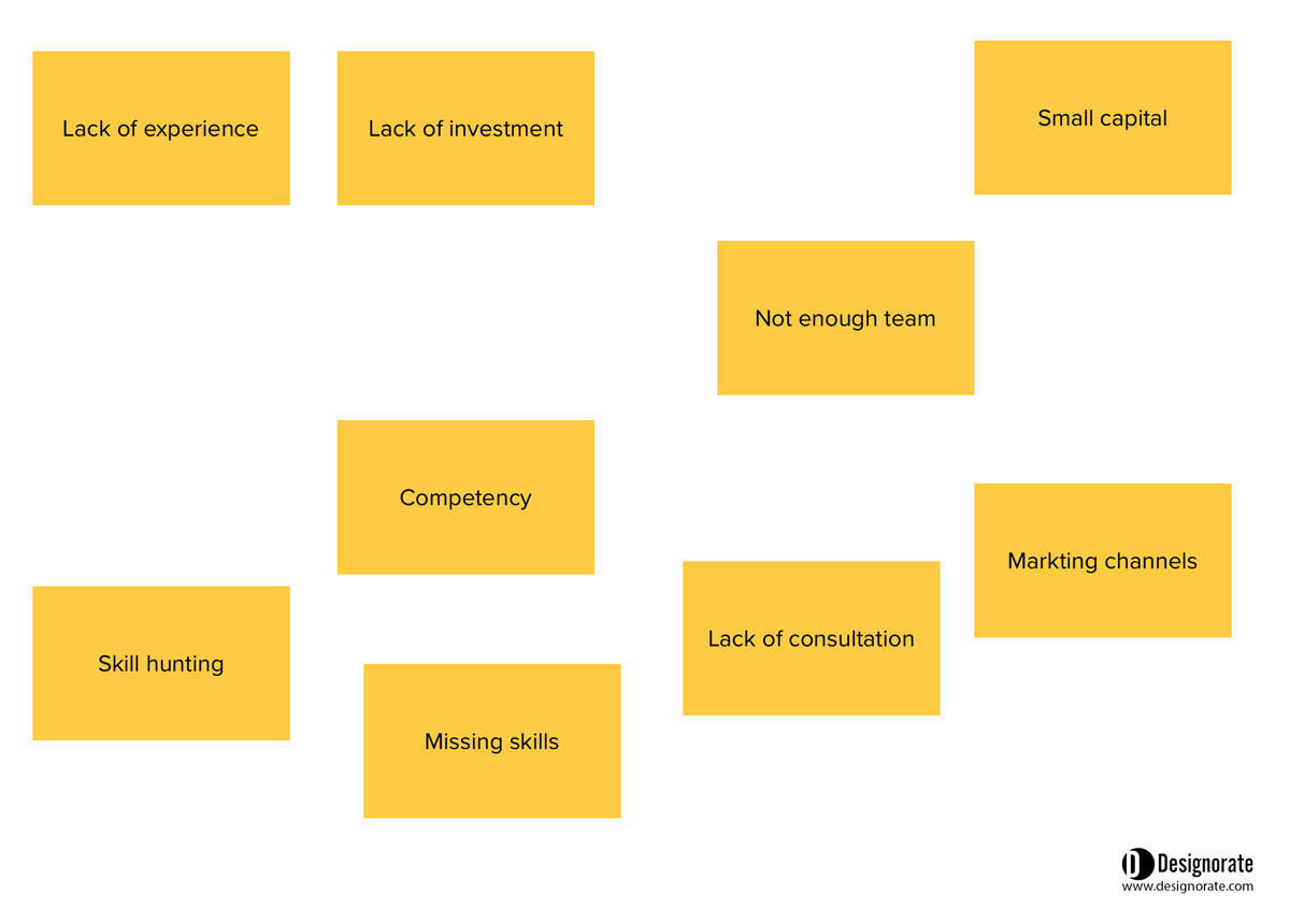
In this step, all the sticky notes are placed randomly on a whiteboard or table. No organization for the raw data is required at this point. The figure below shows how the ideas are placed randomly, with each idea on a separate sticky note.
Step 4: Organise Ideas into Groups
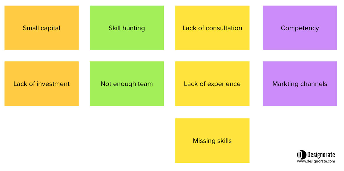
In this step, the ideas are organized into groups defined by the relation between the ideas. So, once one group is created, the team starts to create another group of related ideas, and the process continues until the ideas are all organized into one of the groups. Some ideas may not fit in any groups, in which case they are added to a special miscellaneous group. The ideas in the figure below were organized based on their relation to each other.
Step 5: Add Headers for the Hierarchy
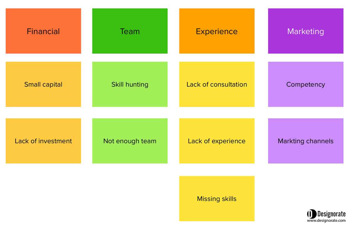
After creating the groups, the team names each group and creates a sticky note with each group name. These are known as header cards. One or two groups can be organized under a super group header, which follows the same rule as the group headers. The figure below shows the header added to each group of ideas.
Step 6: Draw the Affinity Diagram
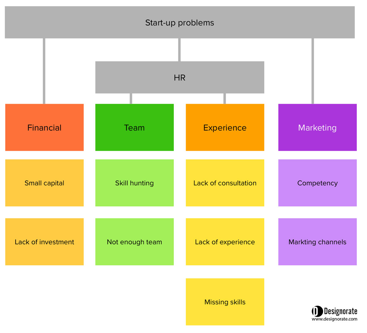
Once the headers, super headers, and groups are created, they are organized on the board, and the team starts to review the relations between groups and modify the tree diagram when needed.
Step 7: Determine Priorities
The added value of the affinity diagram compared with the card sorting is the opportunity to prioritise ideas based on their importance or problems based on severity (check What is the Failure Mode and Effects (FMEA)?). As the tool can be used in several approaches, there are a number of prioritisation matrices. The affinity diagram is based on group voting of stakeholders or experts to build a consensus on an idea or a decision. So, all the prioritisation methods depend on voting and collecting the final outcome based on the group’s decision.
Severity (high H, medium M, low L)
This method is suitable for assessing risk or determining the severity of bugs in software usability testing. In this method, the team vote for each issue based on its severity. The team vote for each problem or software issue by assigning one of the three levels of severity.
Points (1,2, and 3)
A similar method that is commonly used in usability testing is giving the participants a number of priority points so they go through each sticky note and vote for each item based on its level of severity. For example, 1 is the lowest and 3 is the highest priority.
One-Hundred-Dollar Test
This method is good for idea generation and determining the importance of different items. Each team member is given a virtual $100 to assign for each idea. So, an important idea can get $30, and a less important idea can get $5. The members don’t need to vote for each idea. They need to vote for ideas based on their importance until they are out of the given budget. In our affinity diagram example, the team can use this method to determine the most significant problems that face the company.
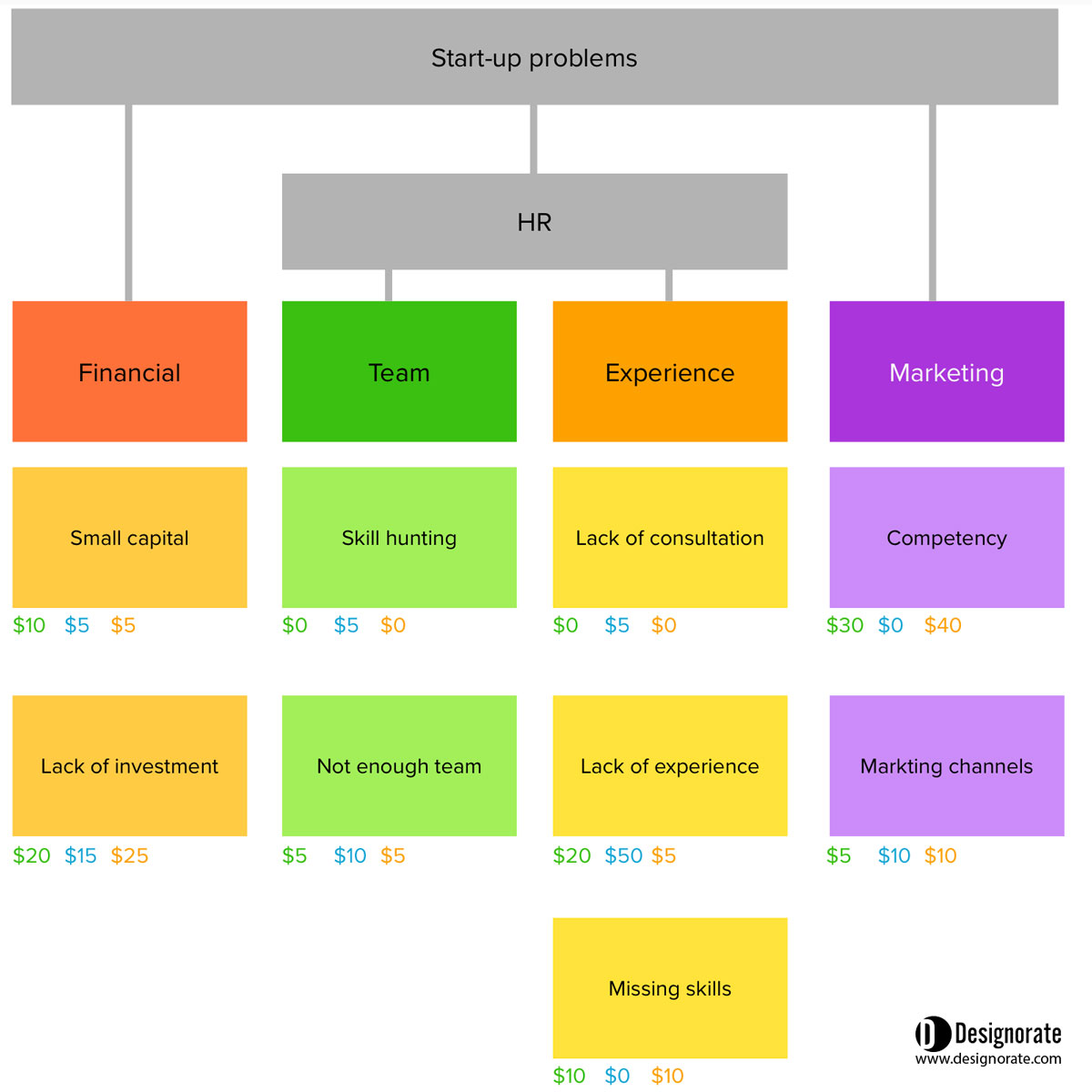
NUF (New, Useful, and Feasible)
This method is suitable for rating ideas during the idea-generation sessions. The ideas are rated based on. Their novelty (New), usability (Useful) and Viability (Feasible). Each criterion is rated from 1 (least level) to 7 (highest level). Each team member rates ideas based on each criterion, and the total rating is the sum of the three factors.
For example, the team member can give an idea of the following rates:
New = 6, Useful = 3 and Feasible = 5
The total rate for the idea = 6 + 3 + 5= 14
Then, the rate is gathered from all the members, and the sum represents the idea’s importance.
Conclusion
There are drawbacks to the group voting methods because team members may be influenced by each other decisions, especially when the members are from one department or have background experience. Another disadvantage shared with many voting methods is that it inflates creative thinking as it is based on democratic voting rather than radical thinking. This syndrome could appear in teams where the members have a wide level of creativity.
The affinity diagram helps teams go beyond ordinary thinking patterns and explore new connections between complex ideas by visually linking the related ideas in groups. The affinity diagram can help reduce the time wasted in meetings because the participants can write their ideas and organize them rather than talking about and discussing their thoughts.
Bibliography
Pernice, K. n.d. Affinity diagramming: Collaboratively sort UX findings & design ideas. Nielsen Norman Group. [Online]. [Accessed 5 March 2023]. Available from: https://www.nngroup.com/articles/affinity-diagram/.
Plain, C., 2007. Build an affinity for KJ method. Quality Progress, 40(3), p.88.
Scupin, R., 1997. The KJ method: A technique for analyzing data derived from Japanese ethnology. Human Organization, 56(2), pp.233-237.


